Monday, July 31, 2006

Where We Go To Be Alone


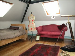
This room sits on a mezzanine floor and is a great place to go if you want to just be alone. The light pours in from the roof lights and it is just a pleasant and quiet place to be. It's built into the eaves of the house so it's a bit like being in a cottage rather than a big Edwardian house.

The tailors dummy is an antique that I found in my first ever shop when I was a knitwear designer so it holds a lot of memories. I've always called her Bertha because she is big and busty.

Incidentally we do use the telescope if it is a clear night but due to living in city we really don't get to see a lot of stars because of light pollution.

The sleigh bed comes in handy if we have an extra visitor or someone is in the huff.

Where We Lounge


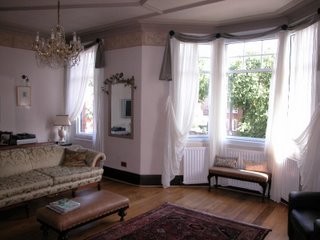
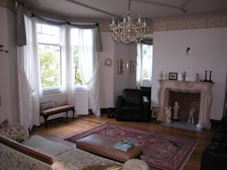
This is my favourite room not just because it's very large but it just has a lovely relaxing feel and is full of all my favourite things. It is very light and airy and has the most fantastic paneled ceiling. It is on the first floor and stretches right across the width of the house. This has always been a drawing room as the Edwardians always put their best room on the first floor.
The house is only yards from a great expanse of fields that is sacred to the city just as Central Park is to Manhattan.
The floor is solid walnut and the French Sofa is my pride and joy and I would never part with it.

Where We Eat


This room hasn't been re-decorated for years as I love it and I'm really not ready to change it. The wallpaper is American which comes in wider widths and shorter lengths than British wallpaper. The floor is solid walnut. This is a very dramatic room that opens out onto the first floor landing. I has a large sash window that looks out to the rear of the house. It houses our youngest daughters dolls house and rocking horse and a much valued 4 paneled antique screen which has a painting of each season on each panel.

This is a lovely room to serve a meal in as we can pull down the double lamp above the table which casts a lovely light over the table.

Where We Cook


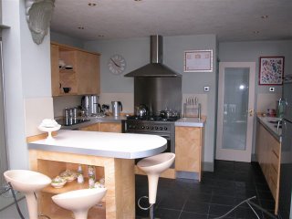
Lots of hard work and testing went into designing this kitchen. That resulted in it being an easy place to work. One of my favourite things is the integrated waste bin which is in a sliding cupboard next to the oven. It frees up so much space.

The breakfast bar sits between the rooftop conservatory and the kitchen and is a great barrier to people sitting chatting whilst I am cooking.

The floor is black slate so when the sun shines through the conservatory roof it doesn't get as hot as white flooring would. The units are made from sycamore which takes on a lovely golden hue with time.

Sunday, July 30, 2006

Where We Chill


A rooftop conservatory may seem a strange place to chill as it does get a lot of sun. Ours has an industrial fan to cool it down on hot days. This conservatory is an extension to the kitchen and as I don't like being alone when cooking it is a great area for people to sit and chat to me. It is made from Canadian Red Cedar which will last a lifetime as it is a super hardwood.

We are lucky enough to face down a back lane that has been planted with climbers along both sides and also has some beautiful roof gardens along it. It's the place I sit every morning with my first cup of coffee and OK a cigarette. This is when I can get my head together as I usually wake up with a hundred things buzzing around in there.

Where We Hang The Washing


This is my backyard. The tree stump leaning against the wall is all that is left of a giant Eucalyptus tree that used to stand in the yard. 3 years ago on Christmas Eve it blew down in a storm and was leaning heavily on the rooftop conservatory. Within minutes 5 big burly firemen were chopping it down as it was a risk to life. I loved that tree and its smell, it was so majestic but life goes on and my friend is going to polish the stump and we will turn it into a piece of useful furniture.

This yard gets the sun all afternoon and we installed a water feature so you can sit and relax with the lovely sound of water running from an old amphora into a bowl of pebbles. Ahhh.

Saturday, July 29, 2006

Where We Do The Laundry


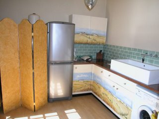
The Laundry leads off the Library so I had think of a way of improving the view. The large boiler in the corner has been covered by a screen I bought from Scumble Goosie as a blank canvas and I just added a birds eye maple paint effect to it and edged it in black. This gives it a Beidermier look. The fridge freezer (for wines, beers and extra frozen foods) had to be chosen to be elegant yet functional. Then came the cupboards, what to do with them. As one of my favourite places is Tuscany I asked my decorator, who is a fantastic water colourist, to paint me some Tuscan landscapes on the doors. I left for work and on my return I saw he had created this. I was truly amazed and it was far beyond my expectations.

The worktops have a birds eye maple effect and the giant sink is from Fired Earth so you can handwash large items in it as well as your smalls. The ironing Board hides behind the screen alongside the boiler and the room has Mahogany French doors leading into the yard.

It is a lovely room to do the ironing in believe it or not. Howe many people can say that?

Where We Work and Relax


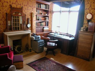
This room has a dual purpose. It is a library to sit in, relax and read a good book and is a hive of industry as it is also an office. Two of the walls are lined with bespoke mahogany shelves and cupboards and it is decorated in rich wines and golds. The old Minster fireplace was in the house when we bought it and fits in perfectly. The leather topped desk looks out onto a yard full of climbing plants and a spiral staircase leading up to a roof garden on the first floor.

We installed a water feature in the yard which makes a wonderful, relaxing sound in the background. The cabinet next to the desk has numerous little drawers in it which hold many curiosities which all the children love to search through.

This room holds lots of antique finds that my partner Harvey has collected over the years. Microscopes, barometers. portholes and scales are dotted all over the room so there is always something to interest someone. Guests use this area to relax in if they rise early and don't want to disturb the rest of the house. So all in all it is a truly functional room.

Where Our Guests Wash


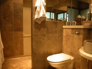
Not only our guests get to use this shower room. I use it every day and I love it. The walls, right up to the ceiling, and the floors are covered in Travertine Marble, the walk in shower tray is also in Travertine and took 6 men to carry into the house. The sink is also Travertine and mirrors span 2 walls (so you can see the back of your head and the bathroom goes into infinity which give a fantastic feeling of space in quite a small room. The shower area is lined with Swanstone, this was to avoid the problem of grouting discolouring where there is so much water. The shower head is a 12" drencher which makes for a fabulous shower experience. This area has a shelf built into the Swanstone for taking all the toiletries. The toilet cistern is hidden in the wall with access via a very useful shelf.

I thoroughly enjoyed designing this room and have never found anything to fault it since it was finished about 3 years ago. When you buy Travertine Marble it is quite a shock to find it is full of holes but the tilers fill it with slurry grout and polish it and it gives the most amazing effect. Expensive but will last a lifetime and longer.

Where Our Guests Sleep


This guest bedroom sits on the ground floor and has its own shower room next door. It is bright and airy and we have purposely planted trees outside the windows to make it seem as though it is in the country instead of on a main road.

The bed was custom made by a local artisan, Stan Pyke. The room is cool and quiet due to the secondary glazing that we installed. A long narrow window above the bed allows light into the attached shower room.

Welcome - The Entrance


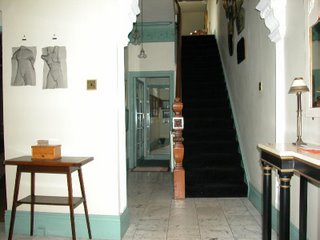
The house is Edwardian and sits in a conservation area and the Edwardians weren't big on light entrances so a lot of hard work has gone into making this entrance as light as is possible. The front door is enclosed in a pillared portico which also blocks out quite a lot of light.
Marble floors, mirrors to give a sense of space and light, black stair carpet to pick out the black in the marble flooring, Lincrusta frieze finished with an aged look, lots of light fittings and a collection of mirrors on the wall leading up to a first floor landing with floor to ceiling mirrors.
Is was an expensive task to bring light to this space I dare not add up just how much all the light fittings and mirrors cost.